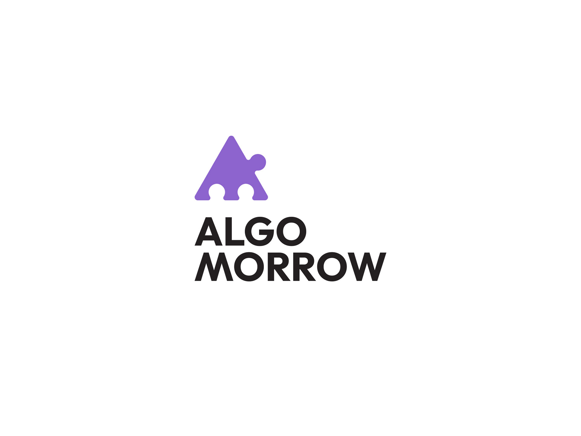
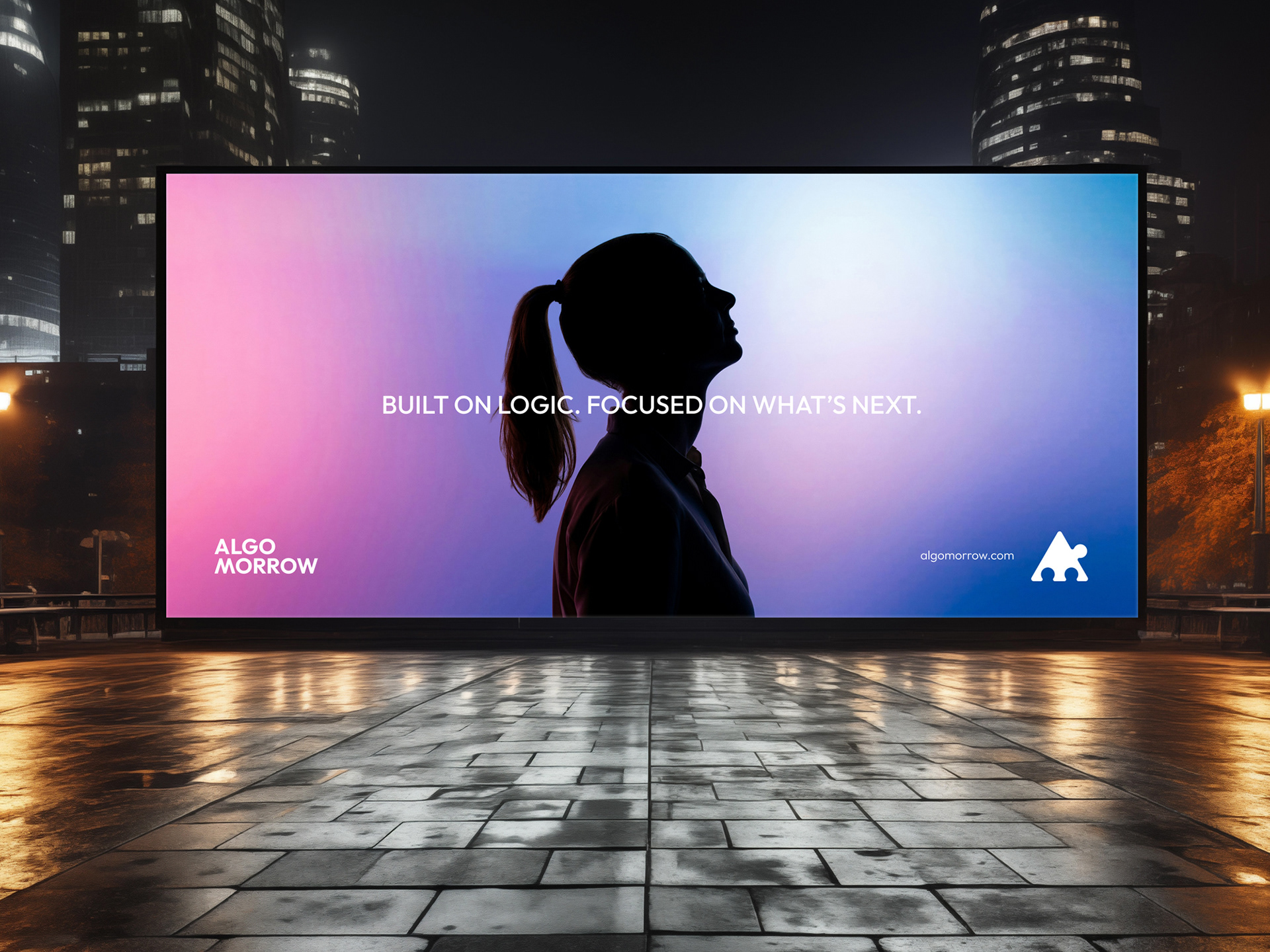
The project began with developing the brand name, forming the conceptual foundation for the entire identity system. “Algo” is derived from algorithm, representing logic, structure, and intelligent systems. “Morrow”, an Old English word for tomorrow, represents what comes next. Together, the name expresses a brand built on clear thinking, purposeful systems, and technology that is always ready for the future.
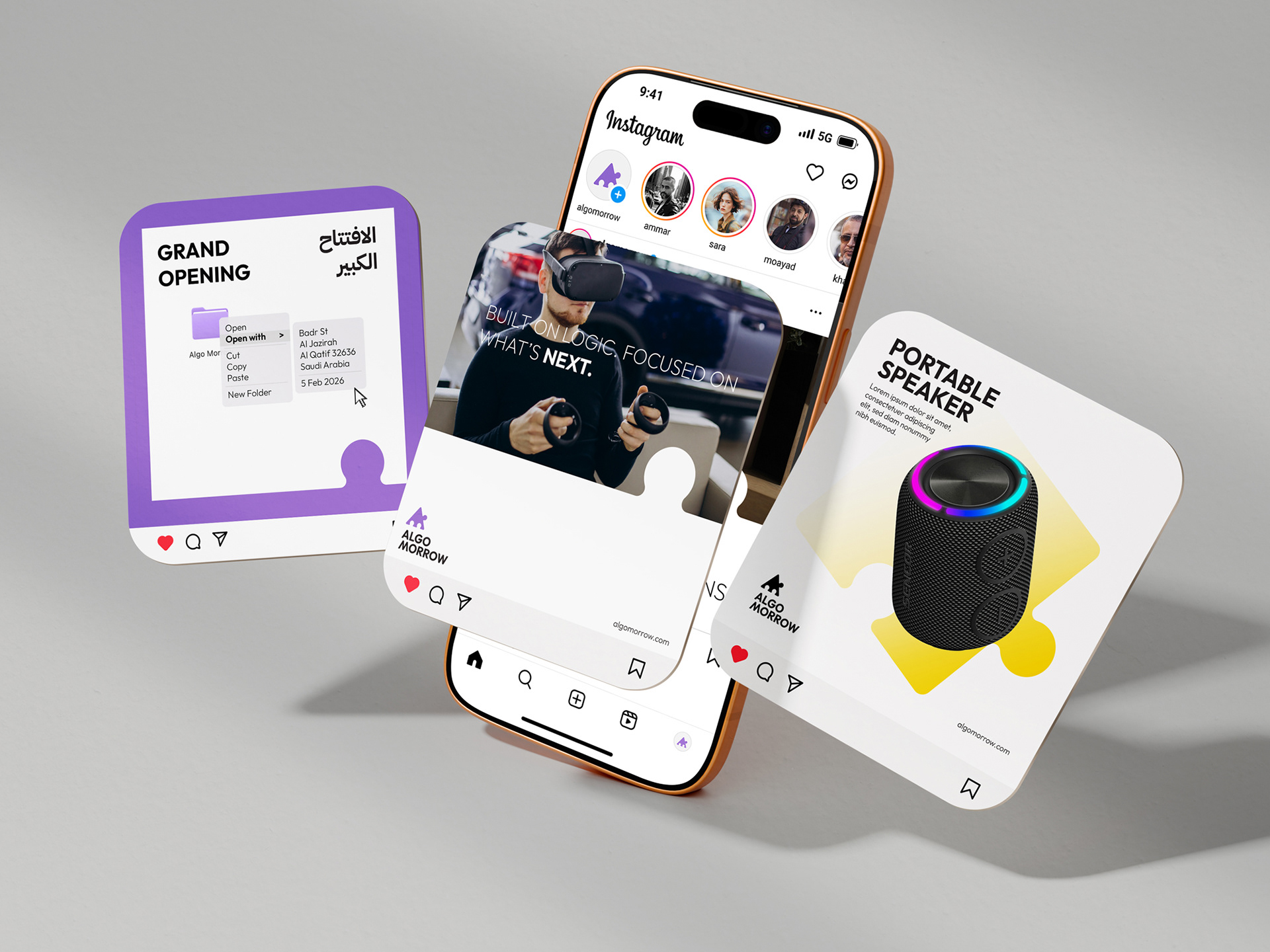
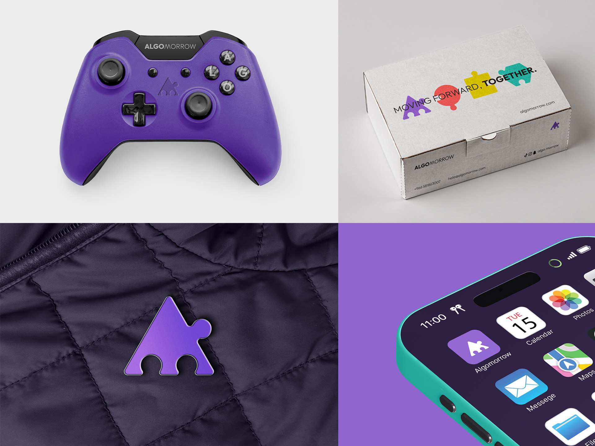
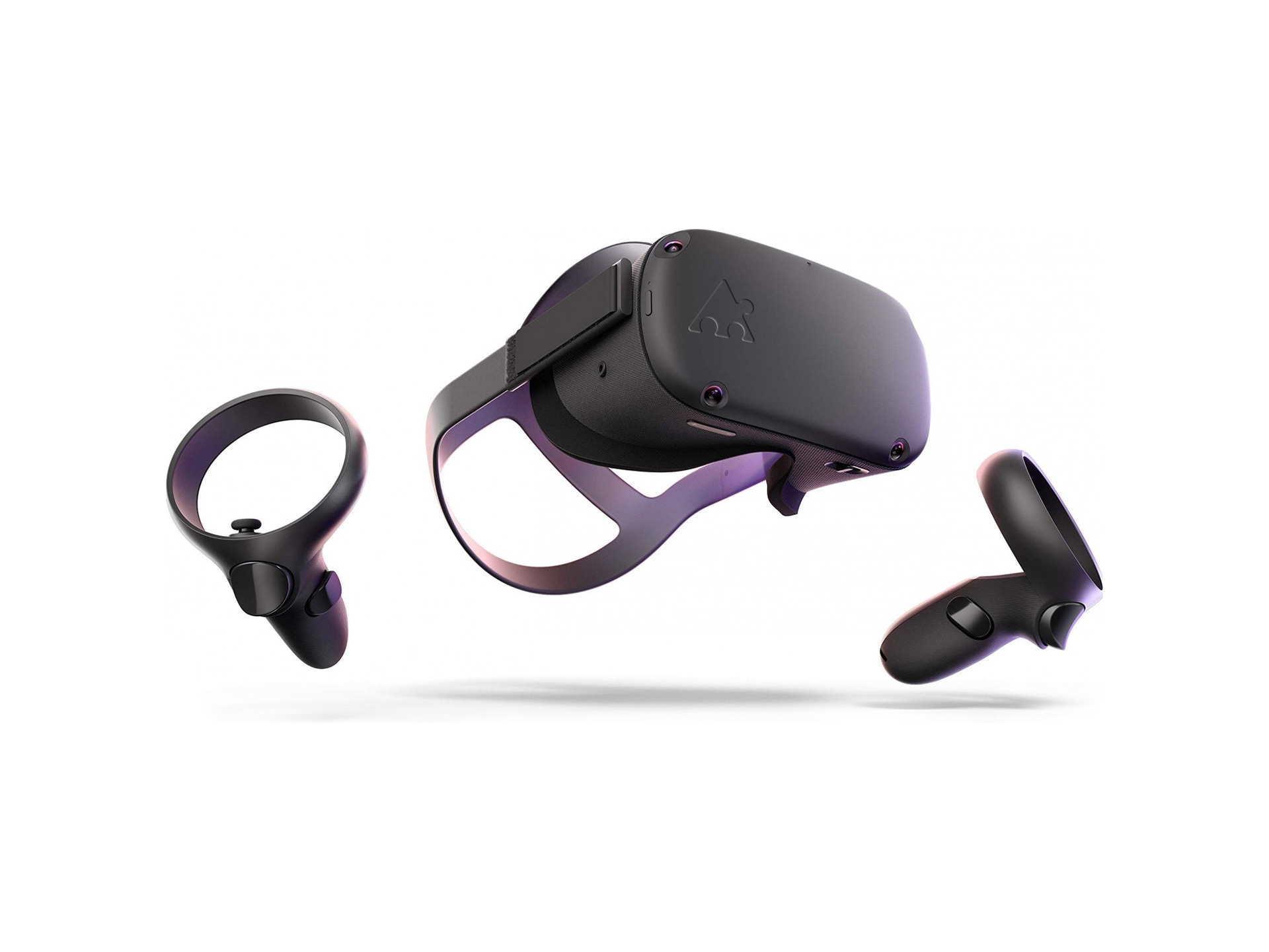
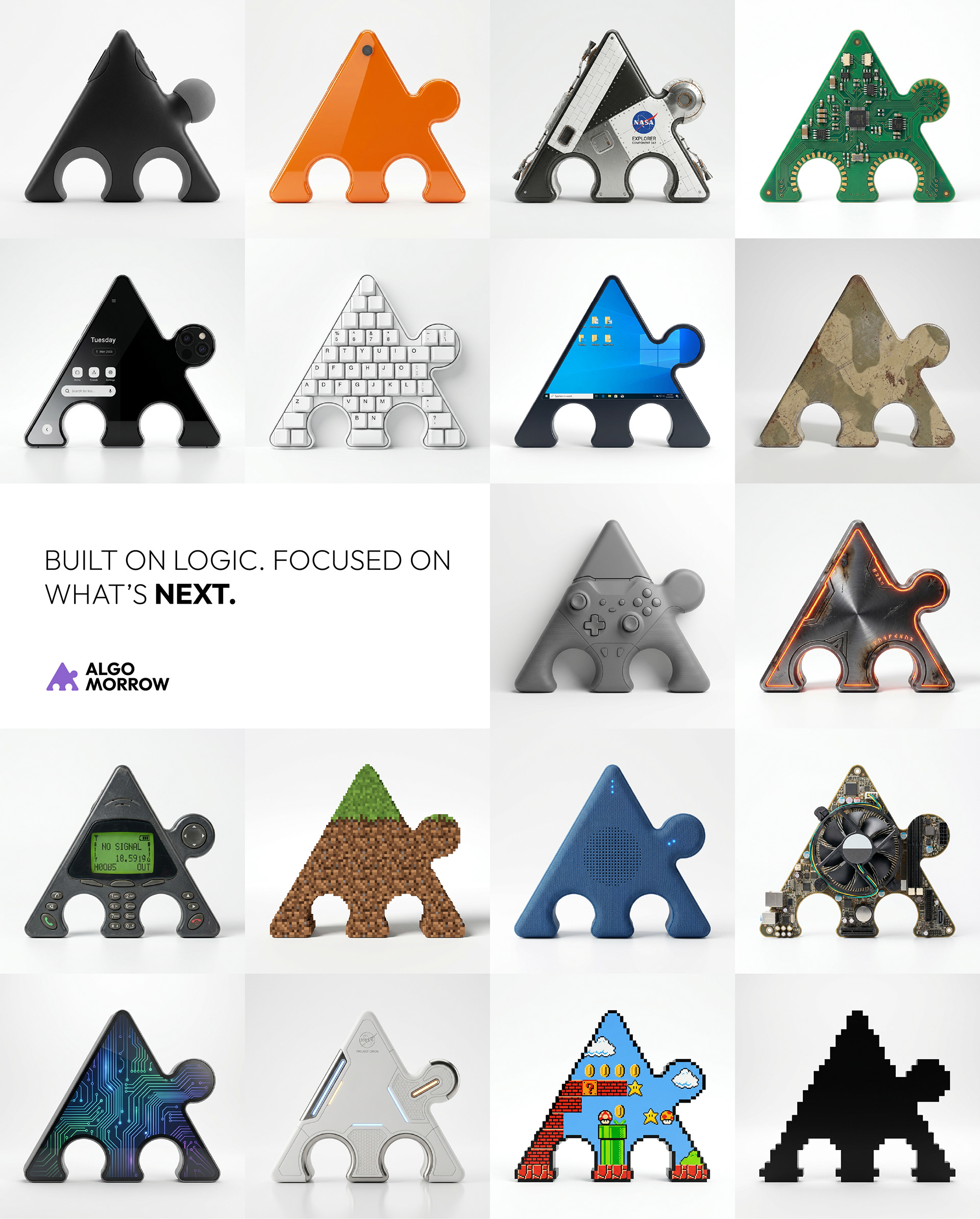
The visual identity was designed around a modular graphic system inspired by structured geometry and connection. The use of jigsaw-inspired forms expresses systems built from connected parts, where value emerges through correct fit and integration. Subtle references to the letters A and M are embedded within the structure, reinforcing the brand name without relying on typography alone. The identity extends into a flexible visual language that supports branding, communication, packaging, and digital applications.
The colour system was developed with the same structured thinking. Algo Violet was selected as the primary brand colour, combining a contemporary technology aesthetic with a subtle reference to the lavender landscape of Saudi Arabia. Supporting colours function as a logical communication system rather than decoration, using green, yellow, and red to represent guidance, progression, and system states across the brand.
The project concluded with a comprehensive brand identity system, documented through detailed guidelines covering logo architecture, typography, colour systems, graphic elements, layout principles, and a modular social media framework, ensuring a consistent and scalable identity across every touchpoint.