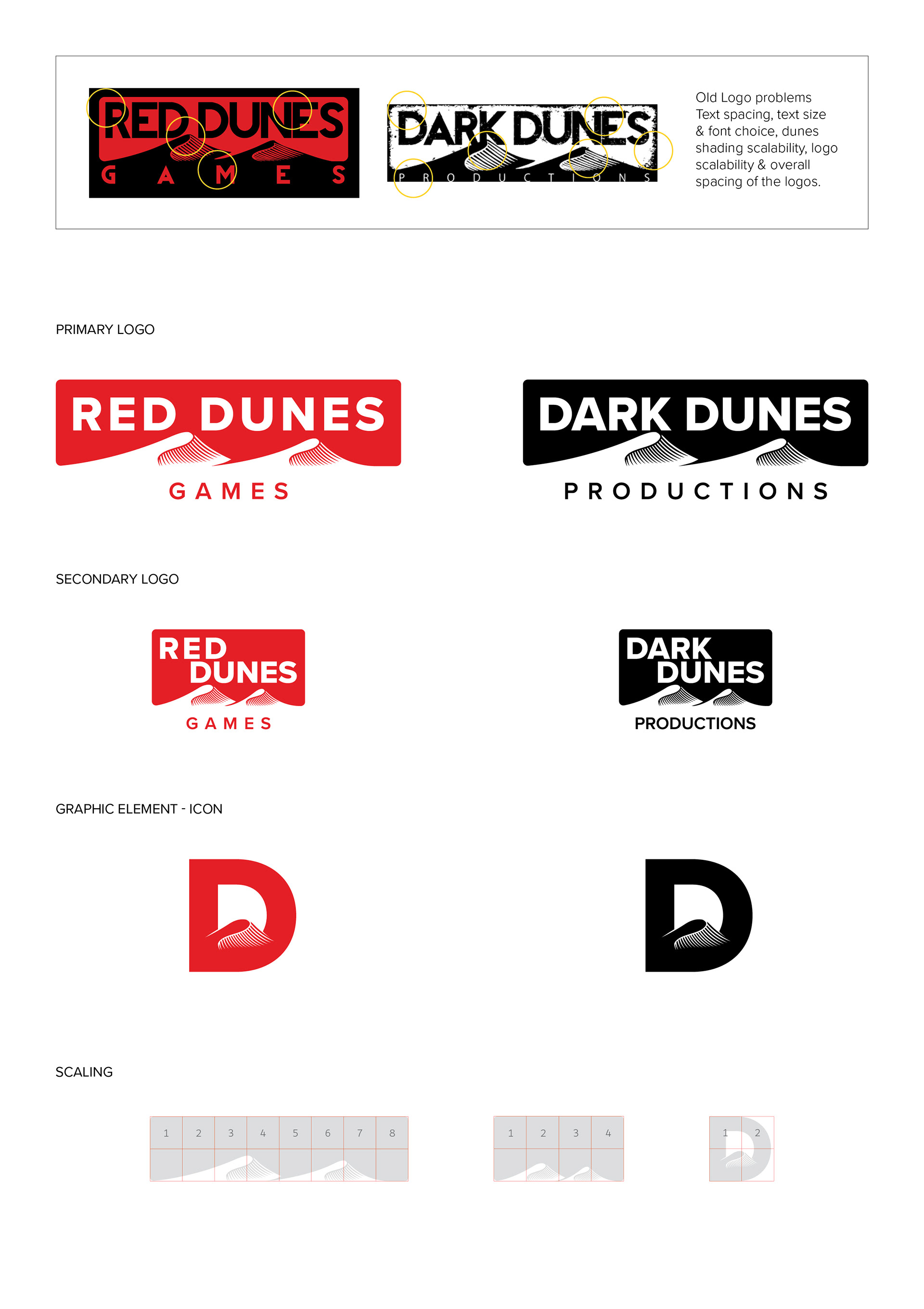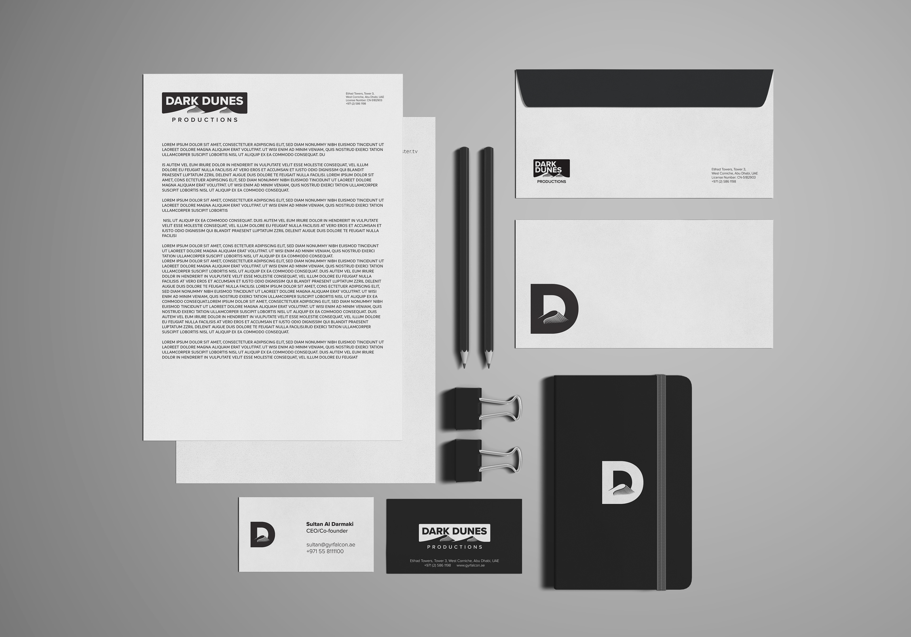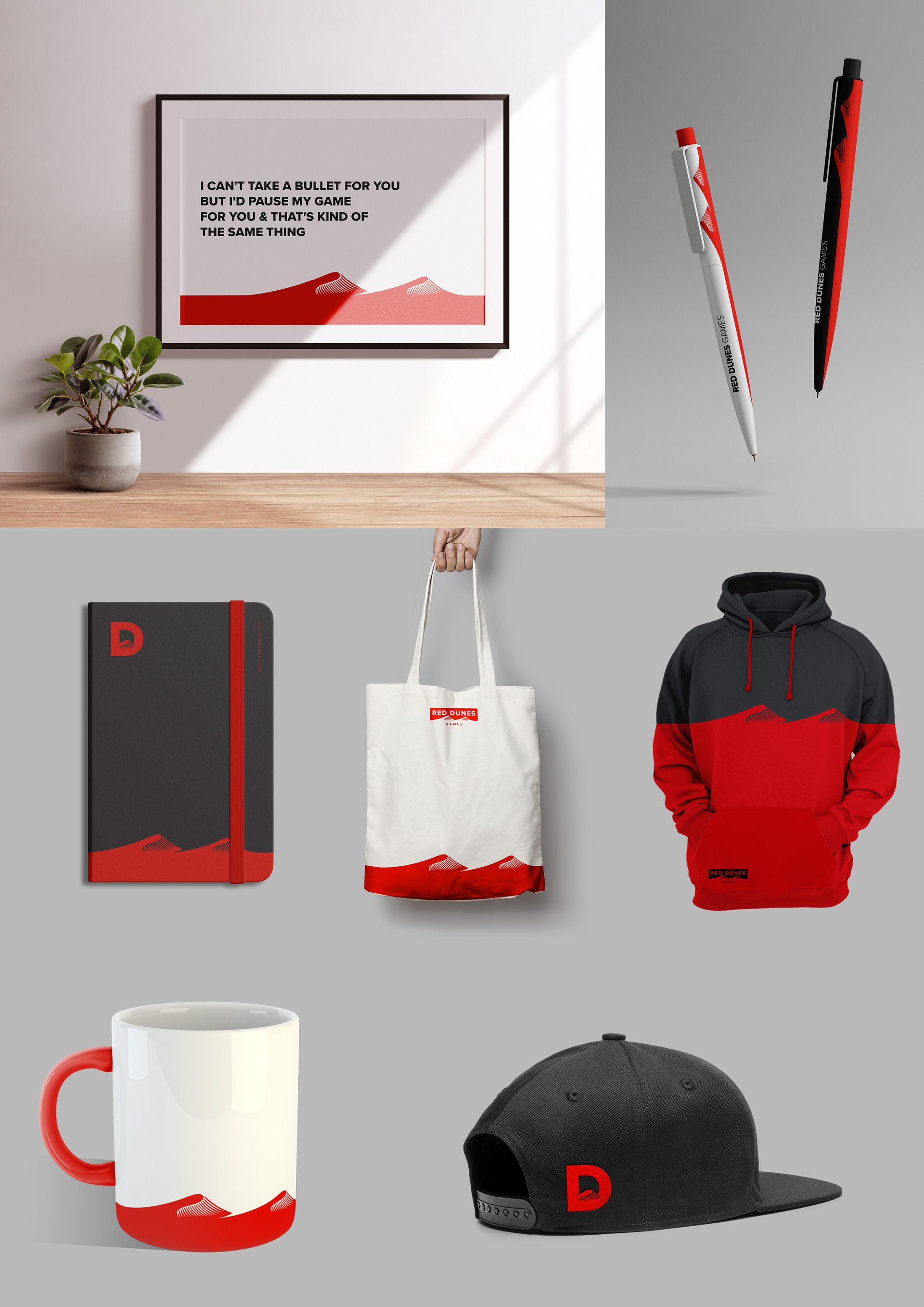
For Dark Dunes Productions and Red Dunes Games, we refined their shared logo to resolve key issues with spacing, readability, font choice, and scalability. The updated design enhances clarity, strengthens visual impact, and aligns with modern design standards, ensuring consistency across all platforms. Alongside the refined logos, we also created a compact icon featuring the letter “D” with a dune element, offering a versatile mark for broader brand use.