The rebrand centred on transforming that meaning into a distinctive visual identity. Rather than illustrating a lighthouse directly, the logo integrates one within the negative space of the letter F, where its beam becomes part of the letterform itself. The result is a mark that is simple, memorable, and rooted in the brand’s name and purpose.
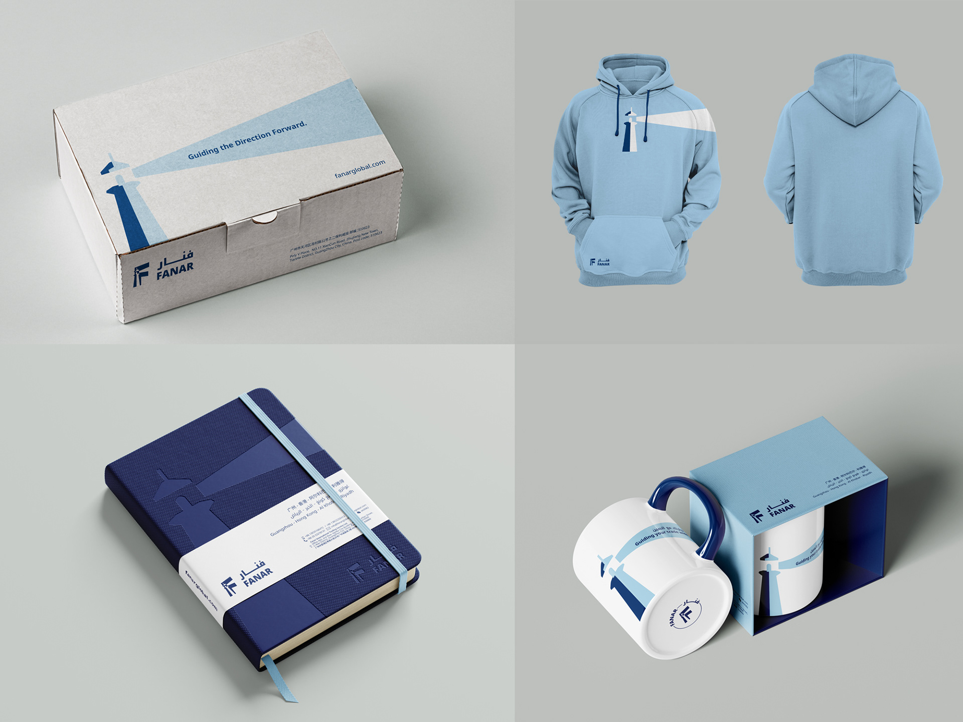
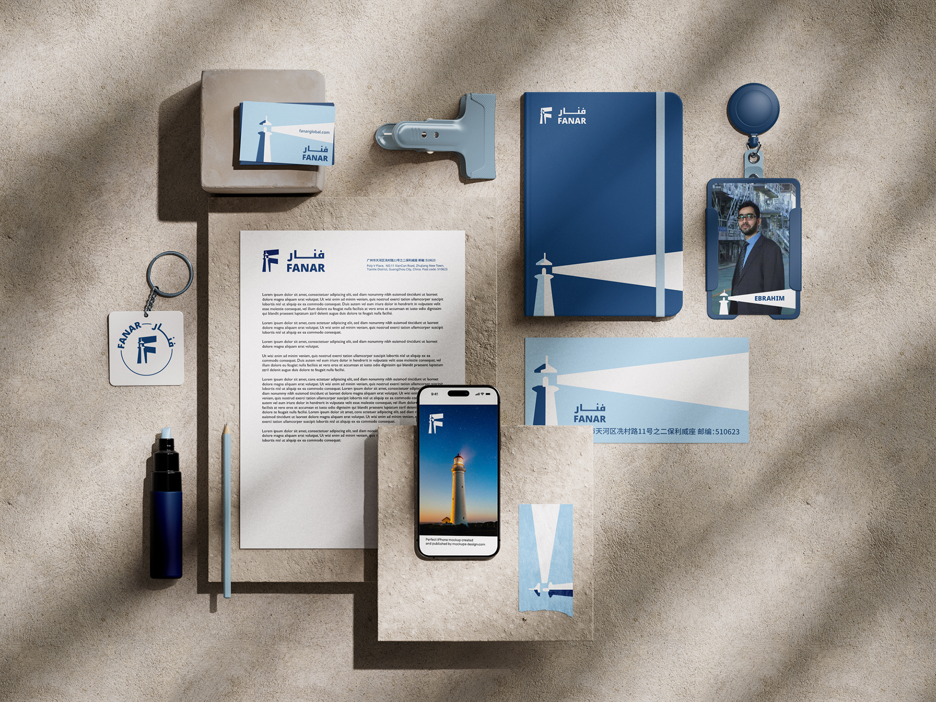
The identity system extends this concept throughout the branding. The lighthouse beam becomes a flexible graphic element across packaging, stationery, merchandise, and digital applications, creating a cohesive visual language while reinforcing the idea of direction and guidance without relying on literal imagery.
The project included logo design, visual identity, brand guidelines, stationery, packaging, merchandise, and a complete collection of branded applications designed to establish a consistent and recognisable presence across every touchpoint.